
Good alt text explains what an image contributes to the page. Sometimes that means describing a product detail. Sometimes it means naming a button's action. For a decorative image, the right alternative can be an empty alt attribute.
This library uses original, illustrative examples to show the decisions behind useful descriptions. It complements the broader image SEO guide, which covers formats, compression, responsive delivery and image discovery. The examples below focus on the words and context, rather than repeating that entire workflow.
Key takeaways
- Describe the information or function the image adds to this particular page.
- Use empty alt text for genuinely decorative or redundant images.
- Explain complex charts in surrounding text or a table.
- Review AI suggestions against the actual image, page context and intended action.
Table of contents
- How do you choose the right alt text?
- Alt text examples for products and places
- Alt text examples for charts and screenshots
- What should buttons and linked images say?
- When is empty alt text the right choice?
- How do you audit alt text on a real website?
- Frequently asked questions
- What should you change first?
How do you choose the right alt text?
Start with the image's job. A useful description depends on why the image is present, what nearby text already explains and whether the image operates as a link or button. The same asset can need different alternatives on different pages. That is why copying the filename into every alt field rarely helps.
The W3C WAI, An alt Decision Tree separates meaningful images, functions, text content and decoration. Use that decision process before editing individual sentences. It prevents a common mistake: writing a vivid description when the reader actually needs an action or destination.
Ask these questions in order:
- What would someone miss if the image disappeared?
- Is that information already available in nearby accessible text?
- Does the image identify a link destination or control?
- Can a short phrase convey its contribution?
- Does it need a separate explanation, table or transcript?
For example, a backpack illustration on a product page helps a buyer understand the item. The same illustration beside a link labeled “Shop backpacks” may add no further information. A full description in both places can create repetition. Choose the alternative for the placement, rather than assigning one permanent sentence to the file.
Alt text examples for products and places
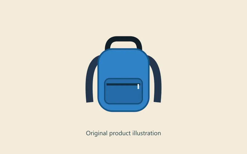
Product descriptions should identify visible details that matter to the current task. Avoid claims the image cannot establish, such as durability, authenticity or market popularity. The following original backpack illustration makes a useful test: its color, shape and visible compartments are observable; its material performance is not.
The W3C WAI, Informative Images explains that a text alternative should convey an image's meaning in context. The examples here apply that principle to fictional products and editorial placements. They are writing demonstrations, not photographs or evidence of client outcomes.
1. A product overview image
Weak: backpack image
Better: Blue daypack with a front zip pocket and black shoulder straps
The improved description identifies the item and distinguishing visible details. It does not repeat every specification from the product description. If the surrounding text already establishes the model and color, the alternative can emphasize a relevant feature that the image reveals more clearly.
2. A close-up of a product feature
Weak: best waterproof backpack for travel
Better: Close-up of the daypack's front pocket and zipper pull
The second version describes the close-up without inferring waterproof performance. If a material test supports a waterproof claim, explain that elsewhere. Alt text should not turn a visible zipper into an unverified product promise. Matching the photograph's actual scope is more useful than squeezing a commercial keyword into it.
3. Several color variants
Weak: backpack backpack backpack
Better: The same daypack in blue, gray and green
The point of this image is comparison. Naming the available visible colors helps the reader understand that choice. Do not use this description for a single blue item. If each variant appears separately with its own accessible color label, check whether repeating every color in every image adds unnecessary noise.
4. A room layout on a design page
Weak: modern office
Better: Two desks face a window, with a meeting table behind them
This sentence describes arrangement rather than relying on a subjective style label. On a furniture product page, the relevant detail might instead be the chair's shape or finish. The purpose of the page decides which visible information deserves attention; there is no universally correct description for every room image.
5. A destination photograph
Weak: amazing place you must visit
Better: Stone steps leading to a hilltop viewpoint above the valley
Describe what the photograph establishes. Name a location when it is known and relevant, but do not invent a landmark, season or shooting position. If the article already introduces the place, the image may contribute the terrain or accessibility details rather than another repetition of its name.
Alt text examples for charts and screenshots
Charts and screenshots often need a short alternative plus accessible text explaining the result. A single alt sentence should not carry a whole report, a complicated interface or every value in a graph. Put the important details where readers can navigate and compare them as ordinary content.
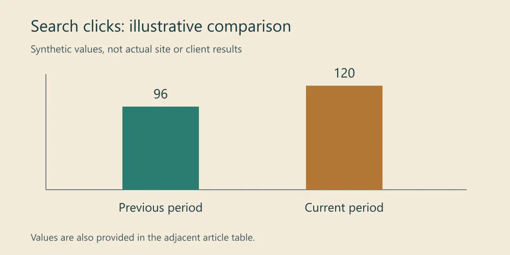
The W3C WAI, Complex Images describes short and long descriptions for detailed graphics. The synthetic chart below demonstrates a practical combination: identify the comparison briefly, then provide its values as text. None of these numbers represents this site's performance or a client result.
| Illustrative reporting period | Search clicks |
|---|---|
| Previous period | 96 |
| Current period | 120 |
6. A simple comparison chart
Weak: SEO chart
Better: Illustrative search-click comparison: 96 previously and 120 currently
The alternative identifies the measure and comparison. The adjacent table supplies the exact values in a navigable form. If the figure's main point is a different pattern, describe that pattern instead. Keep the wording consistent with the actual units, period and visible chart labels.
7. A multi-series performance chart
Weak: graph showing everything going up
Better: Monthly clicks and impressions, with values and interpretation in the table below
The better alternative directs the reader to the detailed explanation without inventing a trend. Include the table and interpretation before using this wording. Describe major changes in the article, especially when two series move differently. For reporting context, see how to measure SEO results.
8. An error screenshot
Weak: screenshot 2026 final new
Better: Example publishing screen displaying “Sitemap could not be fetched”
The error message matters more than the screenshot's filename. Include the complete diagnostic text nearby if the image contains additional instructions. Remove private account details before sharing a screenshot. A reader needs enough information to recognize the problem without having to inspect tiny interface text.
9. A screenshot showing an interface location
Weak: dashboard
Better: Illustrative dashboard with the Pages tab highlighted
The screenshot's purpose is to locate a control. Describe the highlighted area and explain the next step in the surrounding instructions. Do not claim an illustrative mockup is a real Search Console screen. Actual product screenshots should use the current interface and accurately identify what is selected.
10. A before-and-after layout comparison
Weak: website improved
Better: Layout examples before and after reserving space for the main image
This describes the visible change without claiming a measured performance improvement. If you have real field or lab measurements, label and explain them separately. Our Next.js LCP optimization guide covers loading behavior; alt text alone does not reserve layout space or improve loading priority.
What should buttons and linked images say?
When an image is the only accessible label for a control, the alternative should communicate the action or destination. When a clear text label already provides that name, a decorative icon usually does not need another spoken description. Review the complete control, rather than judging its image in isolation.
The W3C WAI, Functional Images distinguishes an image's appearance from its function. A drawing of a magnifier can mean search, zoom or inspect. The intended action decides which name helps the reader. The next examples use simplified HTML to make that distinction visible.
11. An image-only search control
Weak: magnifying glass
Better: Search
<button type="submit">
  <img src="search.svg" alt="Search">
</button>
The button submits a search. Its accessible name should identify that action. If the same magnifier instead opens a larger product photo, “Search” would be misleading. Choose the wording from the behavior the control performs, then check how that name is announced in the actual page.
12. A search icon beside a visible label
Weak: Search Search
Better implementation:
<button type="submit">
  <img src="search.svg" alt="">
  Search
</button>
The visible text supplies the button's name. The icon adds visual reinforcement, so repeating its purpose creates an unnecessary announcement. This differs from omitting the alt attribute altogether. Test the final control if other naming attributes or hidden text also contribute to its accessible name.
13. A logo used as the home link
Weak: logo final transparent
Better: Example Studio home
The logo takes the visitor to the homepage, so its destination matters. If a nearby brand name already belongs to the same link, review the combined accessible name before repeating it in the image. For navigation more broadly, use the internal linking guide.
14. A linked article thumbnail
Weak: person using laptop
Better, for an image-only link: Read the JavaScript rendering troubleshooting guide
An image-only link needs a useful destination label. If the thumbnail and a descriptive article title share one link, the image can often use an empty alternative. Avoid creating two adjacent links that announce the same destination with unrelated names. Inspect the whole card, including its heading and button.
15. A downloadable file icon
Weak: small blue document
Better, for an image-only link: Download the monthly SEO report template
The reader needs to know what the download contains. Mention its format in nearby link text when that helps set expectations. If the text already says “Download report template, Markdown,” the icon can be decorative. Do not label a file as a spreadsheet or PDF unless that is what it actually provides.
When is empty alt text the right choice?
Use an empty alternative when the image contributes decoration or repeats information already supplied accessibly in its placement. Empty does not mean careless. It is an intentional decision that prevents irrelevant image descriptions from interrupting the reading flow. An informative image with no alternative remains a different problem.
The W3C WAI, Decorative Images gives guidance for this distinction. A missing attribute and alt="" are not interchangeable. The following examples show why a blanket rule requiring descriptive text on every image can produce worse results than a context-based review.
16. A decorative divider
Weak: gold curved line with three small circles
Better: alt=""
If the line simply separates sections visually, describing its shape interrupts the article without adding information. Keep the actual section structure in headings and layout. Do not rely on a decorative separator alone to communicate a change of topic or a critical warning.
17. A background-like hero illustration
Weak: abstract blue and orange circles around the heading
Better: alt="", when the image adds only decoration
The title and introduction can provide the meaning, leaving the illustration purely visual. This decision changes if the hero contains a meaningful chart, product detail or otherwise unavailable information. Classify the actual image and placement; “hero” describes its position, not its accessibility purpose.
18. An image repeating nearby text
Weak: Free shipping on orders over $75 repeated immediately after identical text
Better: alt="", when the adjacent accessible text fully supplies the offer
The message still needs to exist as real text. If the offer appears only inside the image, an empty alternative would remove useful information. The W3C WAI, Images of Text explains why the information represented visually must remain available to readers who cannot see it.
19. A decorative stock photograph
Weak: successful business team discussing innovative strategies
Better: alt="", if the photograph supplies no relevant information
Do not invent the people's identities, roles or achievements. A generic office image used for atmosphere may be decorative. A photograph documenting a particular speaker, event or piece of equipment may be informative. The distinction comes from the editorial purpose, not whether the image was free or paid.
20. A meaningful diagram with a nearby full explanation
Weak: A long paragraph copied into alt
Better: Image review workflow; the complete steps follow
Use a short identifying alternative and provide the actual steps as accessible text when the diagram helps organize a process. If the diagram is entirely redundant and purely decorative in that placement, an empty alternative may fit instead. Do not automatically strip alternatives from every diagram merely because a caption exists.
How do you audit alt text on a real website?
Review image purpose and page context before deciding which fields to change. A crawler can identify missing attributes and repeated values, but it cannot reliably decide whether a particular photograph is decorative or whether a control's combined name is useful. Automated findings are a starting list for editorial review.
Use this lightweight review table:
| Check | Question to answer | Action |
|---|---|---|
| Purpose | Does the image inform, operate or decorate? | Choose the appropriate alternative strategy. |
| Context | Does nearby text already convey the same information? | Remove unnecessary repetition. |
| Accuracy | Does the description match visible, relevant details? | Remove guesses and unsupported claims. |
| Function | Does an image-only link or button have a useful name? | Describe the action or destination. |
| Complexity | Would a table or longer explanation help? | Add accessible detail outside the attribute. |
| Delivery | Is the image sized and loaded appropriately? | Review performance separately. |
Google Search Central, Google Images SEO best practices treats descriptive image context as part of helping Google understand images. That does not justify keyword stuffing. Write for the reader's task, then review filenames, surrounding content and delivery in the wider image audit.
If an AI tool generates a first draft, check every factual detail against the image. It may miss context, infer emotions or describe the wrong action. Ask someone to review important product images and controls in the actual page. Keep the judgment with the editor rather than accepting every generated sentence automatically.
Frequently asked questions
How long should alt text be?
Use the shortest wording that preserves the image's useful meaning or function. There is no universal character count that makes every description correct. A short product label and a complex diagram have different needs. Move detailed explanations into accessible page content rather than compressing them into a lengthy attribute.
Should every image contain the target keyword?
No. Add a relevant term when it naturally identifies the image's content. Repeating a search phrase across unrelated images can make descriptions less accurate and more repetitive. A decorative image may need an empty alternative, while a search button needs an action name rather than the page's SEO keyword.
Are image captions and alt text the same?
No. A caption is visible page content, while the alternative supplies an image's meaning or function where the image cannot be perceived. They can complement each other. Review their combined information and avoid repeating a whole caption without considering whether the image contributes anything else.
Can better alt text guarantee higher rankings?
No. Useful alternatives support accessibility and image understanding, but they do not guarantee indexing, traffic or rankings. Content relevance, crawlability and many other factors still matter. Start with a few important pages, document the changes and assess them alongside the broader technical SEO workflow.
What should you change first?
Start with informative product images and image-only controls on important pages. Fix descriptions that omit necessary information, invent details or name the wrong action. Then review decorative images for unnecessary announcements. This order addresses concrete reader problems instead of simply maximizing the number of populated fields.
Use these examples as decision patterns, not sentences to paste onto unrelated images. The right alternative depends on the actual content and placement. For file formats, responsive dimensions and loading behavior, return to the complete image SEO guide.